Home
KASHBA Asiatica
Ais Loupatty
Ton Lankreijer
Staalstraat 6
1011 JL Amsterdam
Open 12:00 – 17:00
Zondag / Sunday 14:00 - 17:00
GESLOTEN / CLOSED
16 okt - 5 nov '25
Contact:
31-20 - 6 23 55 64
06 - 588 41 370

In line with collecting lies displaying. Even for the collector who considers showing to be showing off, applying order in the assortment implies situating, stacking, structuring, in short making things visible. Depending on the items, obviously: coins are very different from ceramics or vintage cars.
And then again, they are not so different.

There is no single monolithic thing called ‘art’, but rather different kinds of art that are distinguished mainly by the reason the art exists, and by what is done with the art once it’s been created. – Mas Nakajima
Knowledge about his collection will not be lacking but when displaying, the collector will need other qualities: an eye for proportions and colour schemes for example. No wonder that quite a few designers and artists do side jobs creating storefronts.
A curator arranging an exposition distinguishes himself - hopefully - by his knowledge of what is shown but otherwise hardly differs from a window dresser. Even though he, the professional, may try to clamour down this association with fancy words, in many museums, for example, the description of an item still hangs as a price tag next to it.
Even if the artwork was formerly revealed thanks to the museum, it now serves as nothing more than a decorative gimmick for the survival of the museum as tableau, a tableau whose author is none other than the exhibition organizer. – Daniel Buren
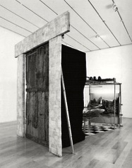
Since the times of Marcel Duchamp (1887- 1968) there have been discussions whether the curator - who selects the artwork for a museum or gallery - is not just as defining as the artist who made it. To sharpen the debate, Duchamp added a fixed arrangement to one of his works: it was only through two small peepholes in a door that one could look at it. He determined how one should look at his art.
Due to the variety of collections – if
Of course, there are rules and guidelines that facilitate, sweeten and stimulate viewing. Whether this ancient conditioning is evo-psycho-sociologically determined and reverberates somewhere in our cortex, uh ... probably.
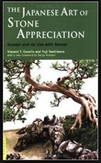
The Japanese Art of Stone Appreciation by C. Covello and Y.Yoshimura is an enlightening booklet. Once you have read it, you doubt whether you had not known all along.
Suiseki and Its Use with Bonsai, as it is subtitled, is about finding and displaying special stones found in nature. As soon as there is more to it – sand, water or bonsai trees for example – it is called, also internationally, bonkei. These past centuries this art of display has become so sophisticated that it virtually contains all aspects of presentation.
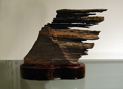
Having never really thought about it, asymmetric was synonymous with chaotic to me. Average digital dictionaries are only slightly less outspoken about it: disproportionate, unbalanced.
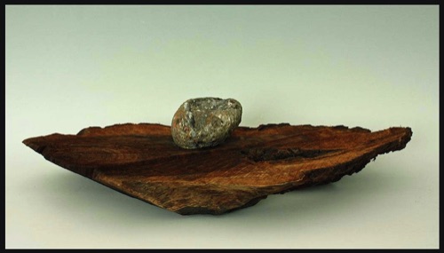
Just place a random object, say a stone or a cup, asymmetrically on an oval or oblong base.
The simple sketches by Covello and Yoshimura show that the most obvious place is at two-thirds.
If you, like me, never really understood the golden ratio, we are getting a little closer here, I believe.
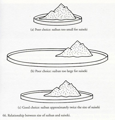
(De rand lijkt me in verhouding tot de ‘berg’ aan de dikke kant).
Many aquascapers follow the rule of thirds, which divides the layout into three equal segments from top to bottom, and from side to side. The focal point is placed where the different vertical and horizontal lines intersect. – Aquascape
Never knew this either: if you want to exhibit a number of objects, it may be a good idea to start with a larger number than you eventually want to display. If there have to be three, group five. Once they lie perfectly, take two away.
Even though these two play no part anymore, the places they occupied seemingly still exist and often make the remaining setup look more natural.

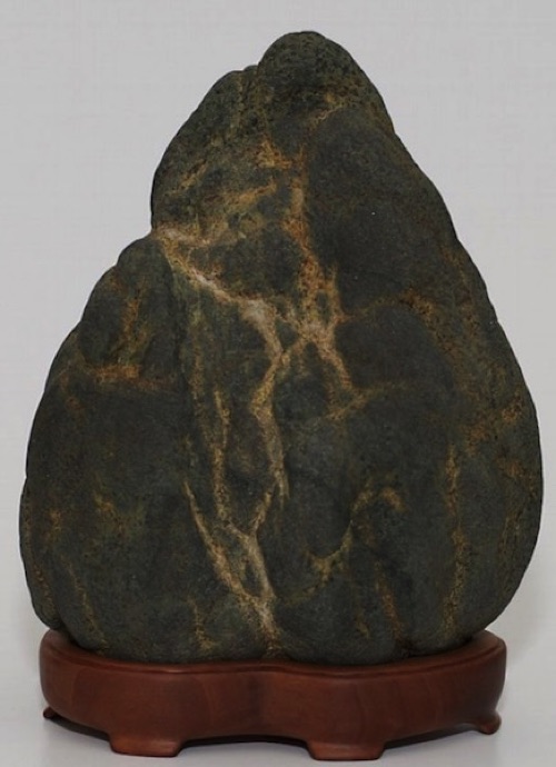
Try checking an internet survey of suisekis to see whether they are well composed or whether something pinches: too fat plateau, too loud or cramped bowl, too high ledge or table, for example:


In 1981 Yuji Yoshimura created this bonkei entitled ‘American Fantasy’. The left perspective of the tableau is a fine example to explore how this artist managed to organize the bonkei so that the whole turned into a so much more than the sum of the parts.
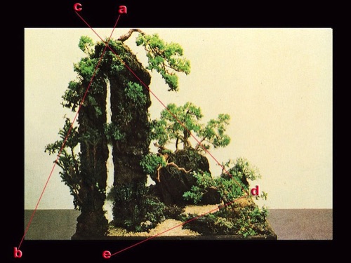
(For clarification I drew some red lines through his photograph).
Only one tree trunk on the left would yield a simple static side. The narrow space between the two trunks – unequal in thickness– and the course of a-b make the left side come alive.
The branch at the top of the thicker trunk has been cultivated downwards to help, along with the c-d line, the two straight tree trunks to better integrate with the lower, bush-like, horizontal part.
Thus the creation acquires a more compact coherence.
By creating an island front-right as an angular point, the riverbed e-d arises naturally from the front-mid meandering towards the back-right.
The water does not bubble up in a contrived way from some bush or rock, the water is there at the front edge and quietly disappears from view at the back – all very serene.
Yoshimura's installation applies knowledge and guidelines for refinement and harmony collected over the centuries, but that makes the result no less ingenious – and peaceful.
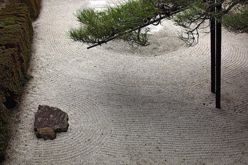
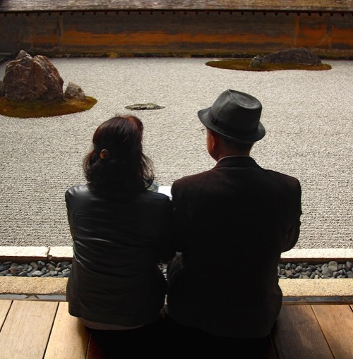
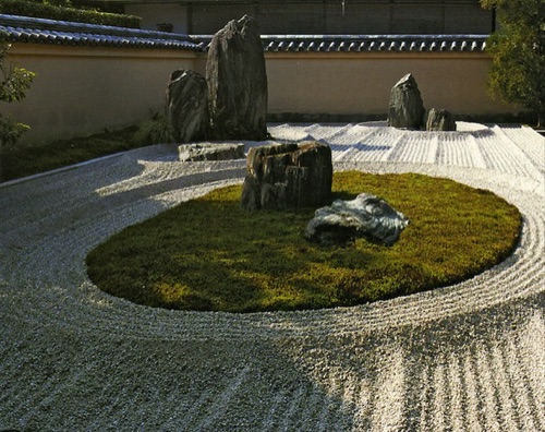
An old and famous karesansui – literally: mountain garden without water – is the fifteenth century Ryoan-ji garden in Kyoto. When you face it, you realize that the garden has been preserved this way and cherished for centuries and why: bordering on perfection, it gets a little detached from reality and becomes somewhat mystical. Seemingly, the rocky islands could not be distributed in any other way across this even plain of gravel.
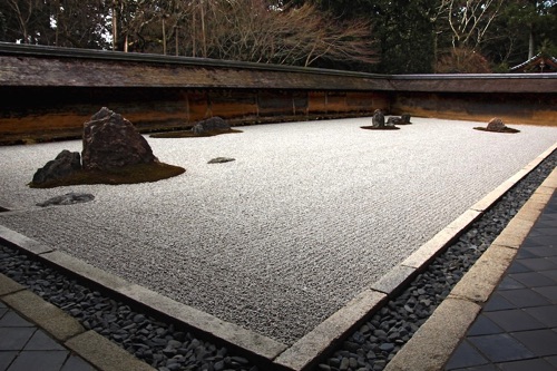
Despite all the respect and admiration the question still arises: what did the wider environment look like during the construction? Did this Zen garden perhaps originally stretch into a rice field or grassy plain?
Obviously, the surrounding lowish wall is an historical and integral component in its own right; the soft mud colour gives a warm glow to the whole.
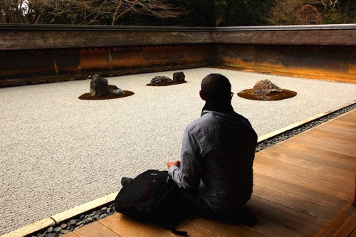
And yet, it turns the old garden somewhat, pardon the association, into a pool. Just like a too broad frame around a painting or a conspicuous pedestal under a sculpture.
Admittedly, the longer the marriage lasts, the better the criticism of the outsider is refuted.
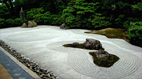
Japanese Garden Design, traditions and techniques by Charles Chesshire contains pictures of contemporary landscapers who took the Ryoan-ji garden as an example.
Their rock formations - amid gravel patterns - are a lot higher, so that no surrounding wall can define the view. In other words: controlling the presentation, not unlike the small peepholes in Duchamp's installation.

In order to direct the attention to a small object, the sixteenth century master of tea-ceremonies Sen no Rikyu thought out a simple arrangement that became traditional with time: along an elongated scroll painting the attention glides gently towards the small object at the bottom, for instance a netsuke.
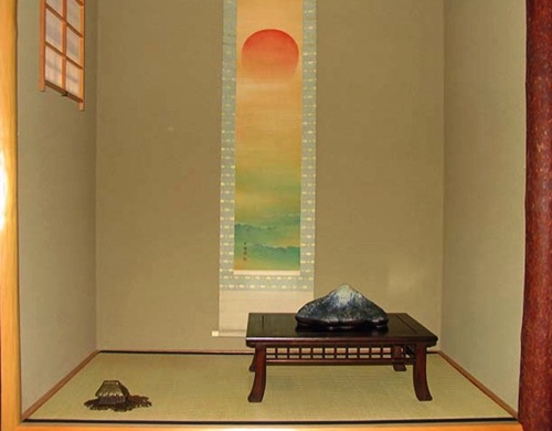
By adding a small object to the front-left the arrangement acquires depth. Like a small bird in the upper corner of a painted portrait or a vague bird sound from an open window during a radio interview.
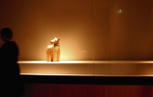
Such silent ‘Zen stylization’ can be found in quite a few Japanese museums – too zenny to my taste at times. A window of roughly three by three metres with a lonely terracotta doggie arouses pity rather than admiration.
The extreme particularisation, the cry for attention, almost turns the whole thing into kitsch. Two small, lone bronze jars in a huge glass sandbox for instance. The examples are legion, also at a large scale

The arrangement of the collection of a 19th century candy manufacturer in Philadelphia in which all kinds of items hung or stood above or beside each other in a jumble – a postman by Van Gogh next to a piece of ironwork – was in itself a museum piece.
In Brussels I saw galleries where paintings almost hung down to ground level.


The upper floor of the Wereldmuseum in Rotterdam exhibits a wealth of Tibetan objects that makes the context, the inter-dependence, at once apparent.
Showing a large number of objects requires a different expertise than
It is not unusual in Japan to reserve a spot in a hallway or a corner of the sitting room for a beautiful object and replace it every so often.
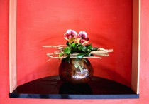
Perhaps the tradition derives from the art of flower arranging Ikebana, which often combines a work of art with flowers or plants. Maybe that tradition arose because of cramped housing.
In the process, it also prevents an

Miho, a world famous modern museum, is located at an hour’s bus ride outside Kyoto, high in the mountains.

On arrival the entrance leads visitors through a mountain via a tunnel lined with a silvery metal.
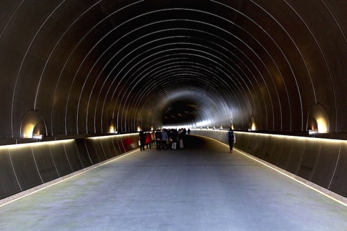
As soon as light dawns again at the end, visitors cast moving shadows upon the long walls.

The yellow stone of the building has - for a museum - a remarkable quantity of glass and its central hall offers a panoramic view of the surrounding green mountains.
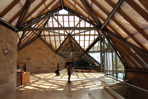
The exhibitions have been composed so meticulously that within an hour one gets the feeling of having skipped a few halls.

The Egypt section has exquisite pieces – that can be counted on the fingers of one hand. The historical development, underlying culture or religious context may only be guessed at.
The India division shows some superb stone sculptures - six in number. If there is anything specific to Indian culture it must be its excessive richness of form.
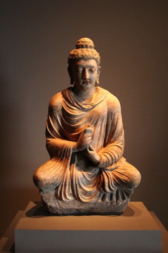
The curator of the Miho museum, however, decreed that a minimum of 250 and maximum of 500 objects from the collection be displayed simultaneously.
So what, next month I’ll just hop again on a twelve hours’ flight, three hours’ bullet train ride and one hour in the local bus...

Usually a collection has been built up over the years piece by piece. Despite the admiration and enthusiasm for each new acquisition, it will just be added linearly to the existing order of the collection.
Collectors often lay the objects down – or hang them up – as if they are still for sale. But not every piece needs to be separately shown as a line of perfume bottles at the drugstore or the Taoist Eight Immortals line dancing in an ethnographic store.

No collector views each piece daily. It is more fun - and more relaxed - to form subsets by grouping and varying heights.

And if you have the time: in changing groups. With each new formation some different component may catch the light.

At the same time the recurring issue of a permanent static arrangement is resolved as well: having to find a suitable place for the latest acquisition.
A customary form, possibly taken from comic books is a treasure box like this one, for instance, once photographed in the Tropenmuseum.

Similarly inappropriate for using at home seems to me the prize podium that Hong Kong traders devised in the eighties for netsukes.


The pragmatic sixties style type case, if authentic, was quite an idea for smaller items, but was a bit too commonly embraced.
Back to the beginning: all the above seems so familiar. Yet, only now did I notice spots where things look – to put it mildly - rather unbalanced. Finally, two examples.
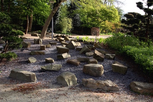
The Japanese garden in the Amstel Park, created for the Floriade 1972, was renovated in 2001. The small rock blocks would do well next to a clubhouse for the kids to eat their sandwiches and catch some sunlight.
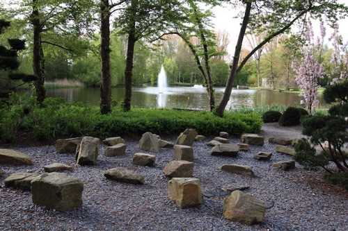
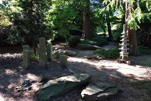
In 2014 a lot of big boulders were dumped around it. They cannot be intended to prevent ram-raid – any layperson can point out a few routes – so it has to be meant as decoration.
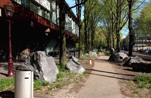
Over the years the Nederlandse Bank building – and outbuildings – got more and more fat on the hips. It oppresses the elderly, fragile Frederiks’ park. The recent addition of an animal sculpture without any vision and a kind of totem pole portrays the world of capital as an arrogant concrete jungle.

See Robert Ketchell for a different approach:

Setting stones is a crucial work in creating a Japanese style garden. Perhaps it is the manner in which stones are placed that distinguishes the gardens of Japan. In the West traditionally stone is set in layers, the emphasis is on the horizontal plane. In the eastern garden the setting of stones is done using in the vertical, diagonal and horizontal planes. Principal stones – that is key placements to an arrangement – are almost invariably set upright. Stone arrangement forms the skeleton of the garden, around which is wrapped a ‘skin’ of planting. – Robert Ketchell
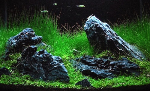


When we do not have that innate, intuitive sense for arranging things so that they seem to have balance, we have the tendency to arrange things in a stylized or symmetrical way — which for the natural scenes we wish to create is a very unnatural and un-beautiful way. It always amazes me that we are naturally drawn to patterns of randomness,
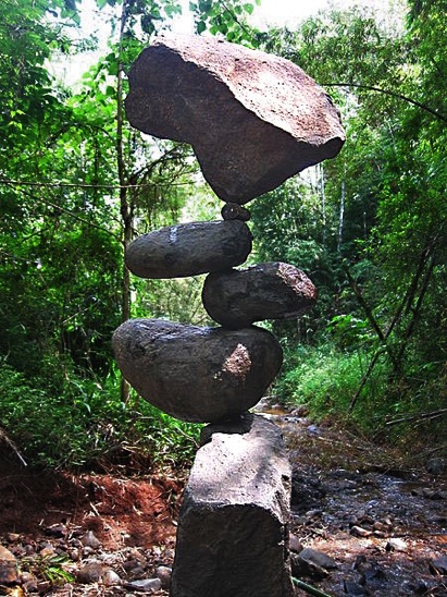
and even chaos, but that when we attempt to create something beautiful we instinctively revert to taught, stylized patterns that we actually, if we come to analyse it, find unattractive. Using an odd number prevents this tendency.

Zie ook: collecting
14 mei 2015 18:42
only in terms of subject matter and size – there are relatively few general instructional books about displaying them. Home decorating magazines, for example, do demonstrate, but do not explain the how and why of furnishing – one might not need the next issue anymore.
(Incidentally, the edge seems to me a bit thick
in relation to the ‘mountain’).
arranging a minimalist exhibition. The more objects, the more complex the interrelations are – and consequently the choices and considerations.
Not every object in these three examples is optimally displayed, but they indicated context and left the choice to me.
object from ultimately becoming wallpaper.
It is, however, a different matter when a museum chooses this approach.
All photographs and texts ©Kashba Ais Loupatty & Ton Lankreijer.Webdesign:William Loupatty

